Explore how color influences emotional storytelling in photography through decision-making in shooting and post-processing.
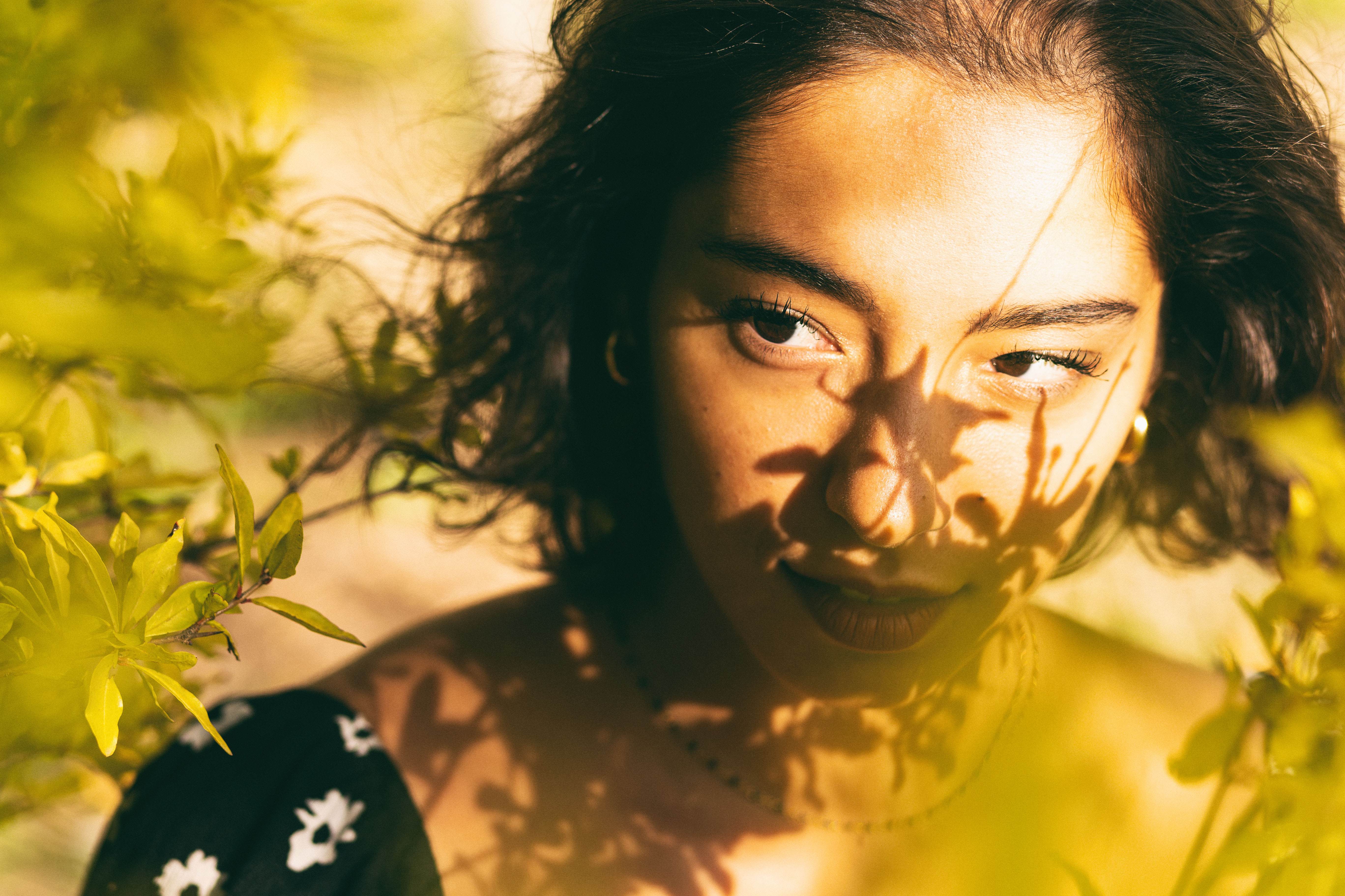
Every hue in a photograph influences emotion, whether you consciously intend it or not. A cool blue cast suggests calmness or distance, while a warm orange glow evokes intimacy and transience. Saturated reds create urgency, and desaturated greys hint at stillness or loss. Understanding how to use color effectively can significantly enhance emotional clarity in your images.
Color should not merely be a reactive element; instead, it requires deliberate thought both in shooting and during the editing process. This intentional approach sets the tone for the image and guides the viewer's emotional response.
Color Carries Meaning Before Content
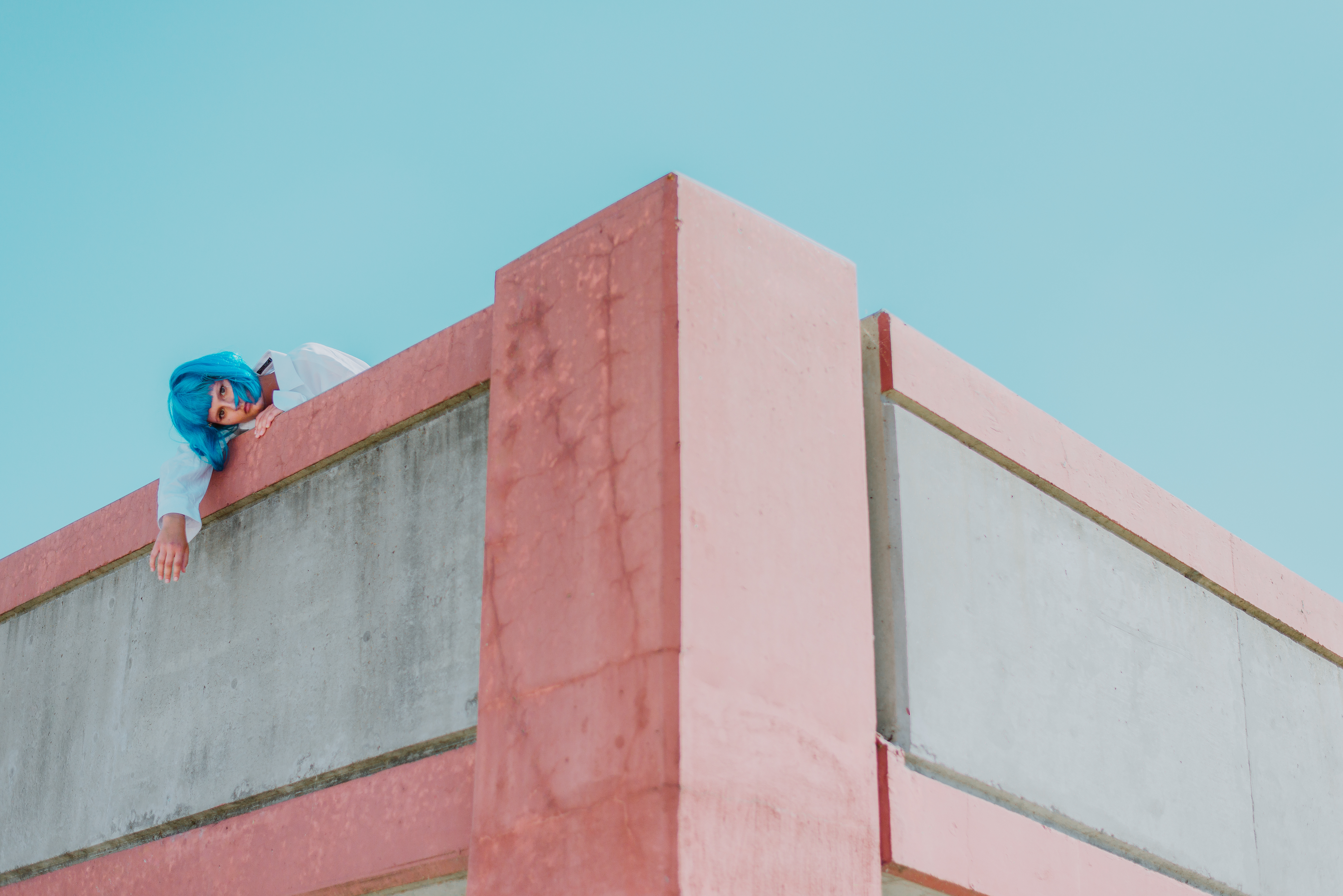
Often, color impacts perception before a viewer even registers the subject matter. The emotional temperature of a palette plays a crucial role in how a photograph is received. Typically, warm colors convey safety, while cool tones create a sense of detachment. High contrast might convey tension, while muted tones bring about feelings of nostalgia or melancholy.
The color palette isn’t simply an aesthetic choice; it's fundamental to the image's emotional resonance. Before viewers can focus on what's happening in a photo, they often subconsciously register how its colors feel. This emotional groundwork shapes their subsequent interpretation.
The Message Behind Warm Colors
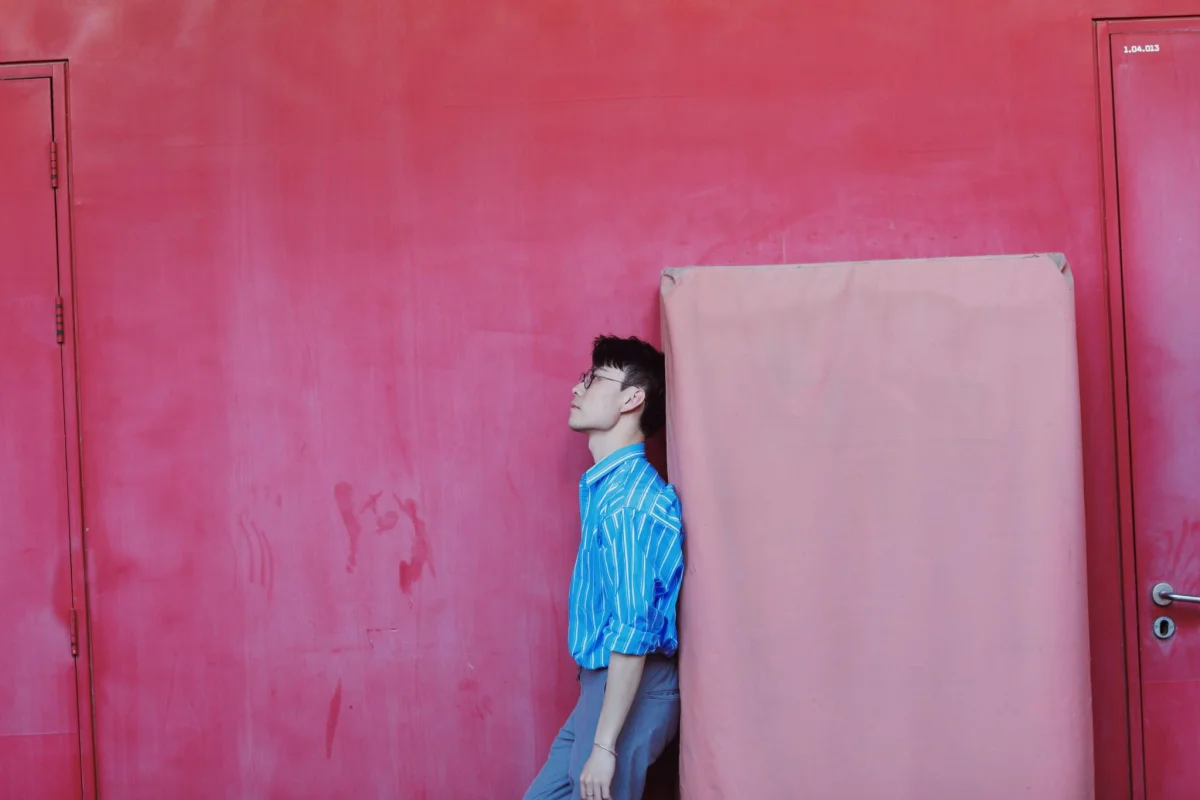
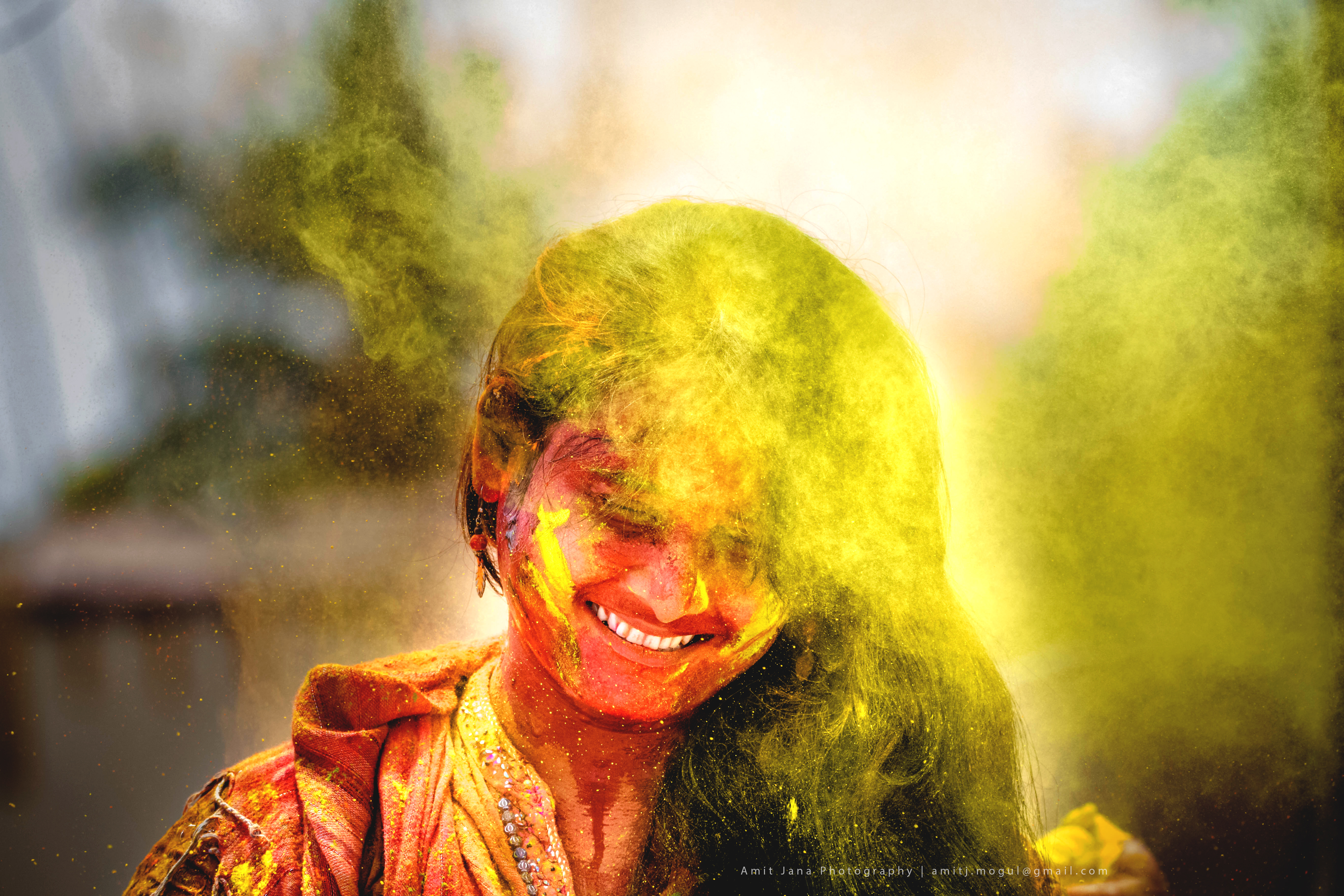
Warm colors—reds, oranges, and yellows—evoke feelings tied to heat, intimacy, and energy. These tones visually advance toward the viewer, creating an immediate atmosphere. In portrait photography, warm lighting fosters a sense of intimacy, connecting the subject and viewer. In landscapes, warm hues such as those seen during golden hour inject vibrancy and transience, making the moment feel fleeting.
Commercial and food photography benefits from these warm tones too, as they stimulate appetite and impart comfort. However, it’s essential for warmth to feel genuine—natural light that possesses warm characteristics can resonate more authentically than warmth added artificially during the editing phase.

Processed with VSCO with a8 preset
The Communication of Cool Colors
Cool tones—blues, greens, and grey-blues—tend to recede, establishing a sense of distance and calm. They foster an atmosphere of solitude, introspection, and stillness, slowing the viewer's emotional pace. In landscapes, these tones may invoke early mornings, shadows, or winter, while in portraits, they can create emotional space, often making the image feel reflective rather than approachable.
Taking the same subject photographed during golden hour and then again at blue hour results in fundamentally different emotional experiences. The changes are dictated entirely by color, demonstrating its profound impact on viewer perception.
Saturation as an Emotional Dial
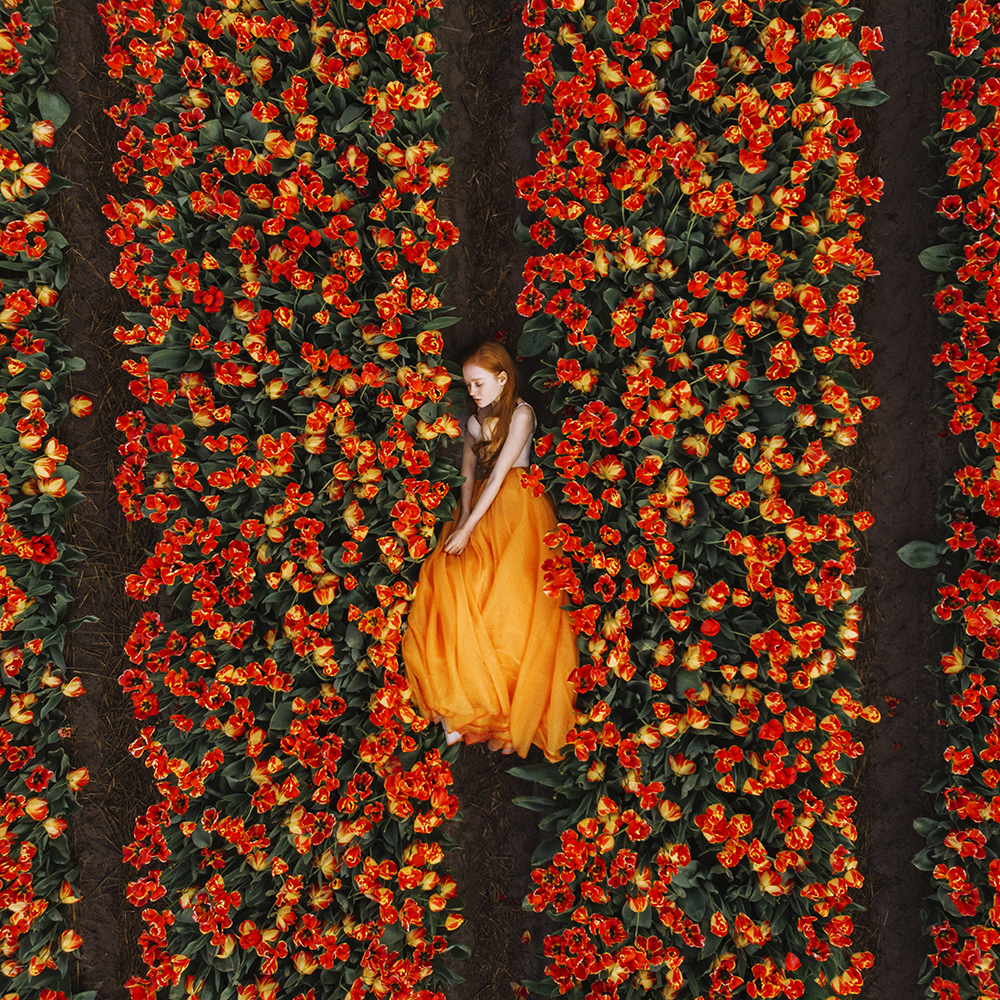
Saturation governs the vibrancy of a color palette. Highly saturated colors are dynamic and immediate, while desaturated tones yield a quieter, more reflective vibe often associated with a sense of nostalgia. Black and white photography strips away color entirely, forcing viewers to engage more deeply with the tonal values, textures, and forms present in the image.
When editing, allow your artistic intention to guide the saturation adjustments. If your aim is to evoke vibrancy and a sense of liveliness, maintain a higher saturation. Conversely, if you wish to convey nostalgia or contemplation, reducing saturation can be effectively more impactful than exaggerating it.
Integrating Color Decisions
Color considerations begin long before editing. Decisions such as the choice of backgrounds or the positioning of your subject concerning available light are all fundamentally tied to color. These choices determine the emotions evoked in the completed image, even before you've opened your editing software.
The most successful photographs tend to showcase harmony between palette and subject, conveying a unified emotional narrative. If the color and subject communicate conflicting feelings, the result can appear muddled. However, when they resonate in unison, the intended emotion is communicated powerfully, often provoking an instinctual understanding in the viewer that goes beyond visual interpretation.
Utilizing color intentionally can transform your photography from mere images into compelling emotional narratives, enriching the viewer’s experience.
The post Harnessing Color to Evoke Emotion in Photography first appeared on 500px.